The way a home looks is not ultimate. It is not the most important thing, but it is something we should give our attention to. Just as the Lord set Adam & Eve in a garden to cultivate it and work the land, He sets us on the property He desires & gives us the home He intends to tend to it, to care for it, and to make it beautiful. All of this is so that home will function the way He intended it to, to minister grace to the families that live within them as well as to the people we invite in. We bear the image of the Creator, so it should come as no surprise that we create beauty around us according to the various ways the Lord has fashioned and gifted each of us. Material things are not ultimate, but neither are they to be completely overlooked.
By wisdom a house is built, and by understanding it is established; by knowledge the rooms are filled with all precious and pleasant riches. Proverbs 24:3-4
As you enjoy today’s post I want you to let the foundation of where this is coming from to be firm in your memory. If you missed the beginning of this series on home you can read them right here.
Part 1 The Grace Full Home
Part 2 The Making of a Dream House
Part 3 The Inviting Home
There’s just no way around it, despite design aesthetics, space configurations, color schemes, and ultimately decor choices, pretty much every woman everywhere desires a beautiful home. And this is not a bad desire. There can be temptations toward materialism, comparison, greed, and the like but if we can avoid these pitfalls I do believe creating a beautiful home is not only possible but even a godly endeavor.
Today I’m going to share two of the biggest design choices I’ve observed that impact a space; there’s nothing revolutionary here to be sure. I’m just letting you in on how I think through a couple of elements of design. I also want to share one practical solution I’ve implemented that helps every space irregardless of size or decor style. I did not study interior design in school, so I make no such boast in that regard. Since I am often asked about this topic, I am simply telling you today what I think pleases the eye. These are take it or leave it type tips.
Color Scheme is Everything:
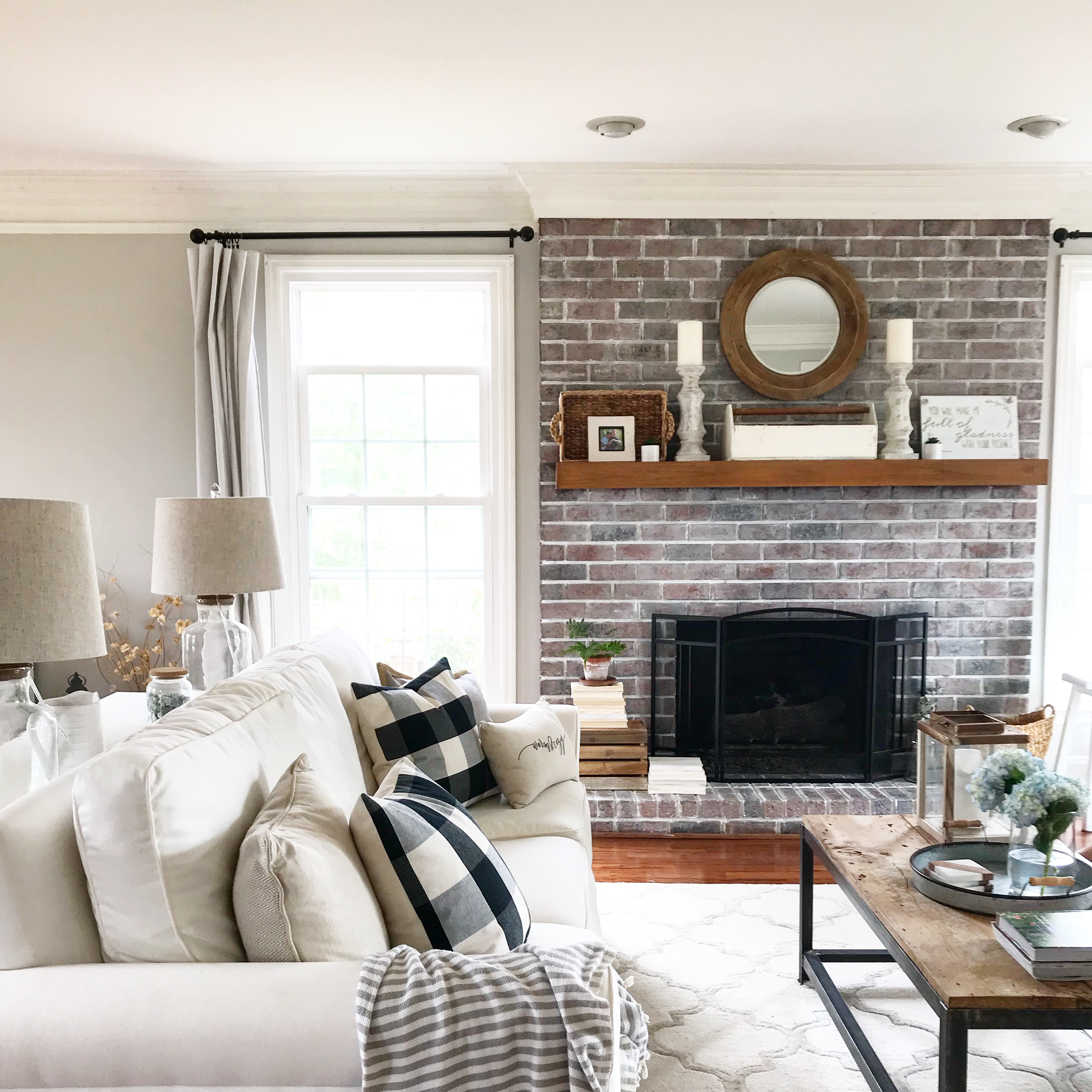
At the end of the day, this really comes down to personal preference, but if you’re going after the look of the homes most of you are pinning on Pinterest, I’m going to recommend keeping with a neutral color palette. There are a LOT of neutral color schemes and many of them I find pleasing. My favorite is probably a pure white wall, because white is my favorite if you can’t tell (winking smile). We did not choose a white wall for our home at present, because of the reality of four young children and the tedious nature of painting our gorgeous crown molding, not to mention, huge built-ins. We were not up for the task of going all white at the start. After white a soft, light warm gray or similarly toned beige would be my pick. Colors like SW Agreeable Gray and SW Accessible Beige are universally beautiful in a wide range of homes. Paint colors that can basically look good anywhere are rare in my book. They are some of the only paint colors out there that I would venture you could buy without even purchasing a sample bucket. They are pretty perfect neutrals and tend to make small spaces feel bigger and with the right curtains, larger rooms take on the light and airy feel that so many people enjoy. These paint choices work for a wide range of design preferences too, anything from modern to farmhouse to eclectic to any combination of styles. Paint serves as a base. It’s like the background color of the canvas you’re painting on. It is like good foundation, it just makes whatever you put on top that much more stunning. A quick Pinterest search will load you up with pretty of ideas in terms of color scheme, and it really is worth the hard work it sometimes takes to get this one right. It is not paint color alone that makes a room stunning, but a room will never look stunning if you get this one thing wrong. You might be thinking that’s pretty elementary, true, but it isn’t natural to all of us and since it’s such a critical part of any design I thought it worth mentioning.
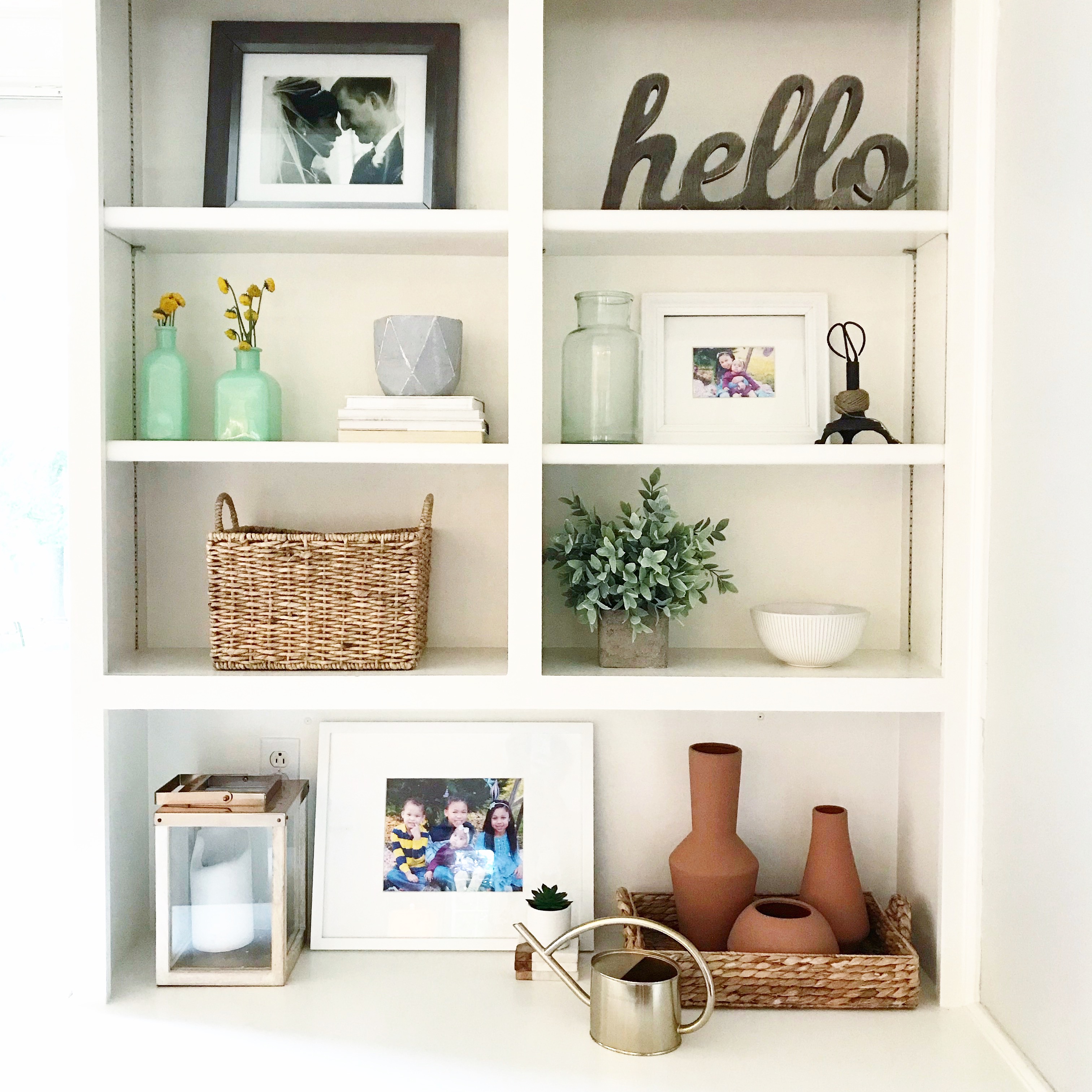
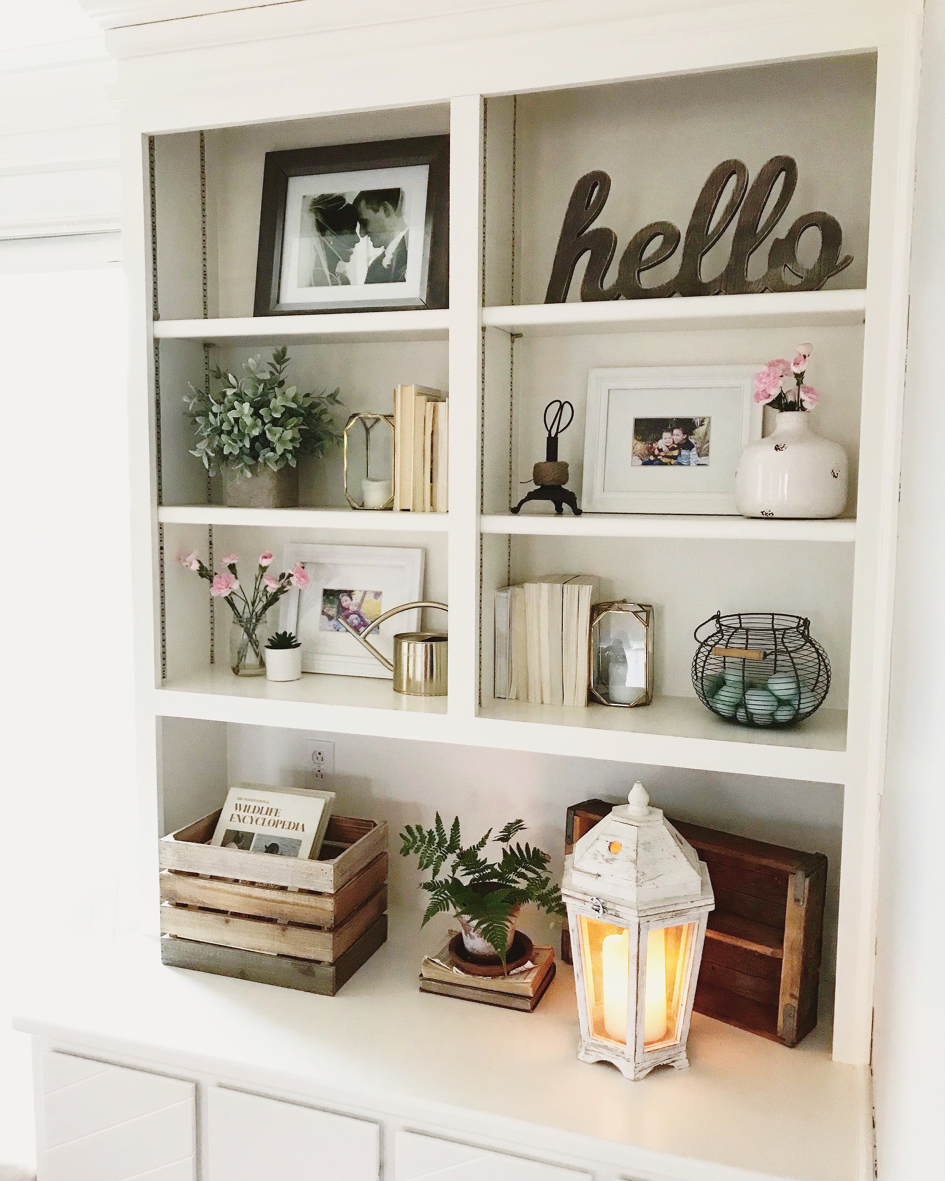
Above our built ins styled for spring.
When selecting a paint color for a main living space, remember every home is positioned differently, with varying degrees of light seeping in, pay close attention to your particular situation. A large family room might have big windows, but if a portion of the light is coming in through a patio door that leads to a screened in or covered porch, your room will dim despite the doors and windows, your paint color has to account for that otherwise your space will feel unnecessarily heavy or dark. On the other hand if your room has a lot of windows at certain times of the day it may get flooded with light, walls that are too light in color may then appear washed out or maybe even blinding. If you aren’t confident in your selections try them out and if you don’t LOVE it, don’t buy it. Without the right paint color in a room nothing will come together. You can buy & buy home decor, but you cannot purchase enough decor to overcome the wrong color in a room, ain’t gonna happen.
Sizing Things Up:
This one might be hard to communicate in the format of a blog, but it is important enough to me that I’m going to try to convey this point anyway. Make sure you’re buying decor (mirrors, frames, vases, candle lanterns, and the like) in the appropriate size. There’s a place for small delicate things to be sure. In fact, I have a precious young woman in my life, Lydia, who does this quite beautifully, but the majority of homes I’ve seen that use items that are small look trinket-y (guess I made that word up), and the look of a room filled with objects that are too small tends to look cluttered not like the organically gathered space most people desire. A room takes on a trinket-y feel when we buy too many little things. Note: I did NOT say nothing can be small. It often works well to combine pieces of varying sizes together. You CERTAINLY need differing sizes to achieve a cohesive design look. However, too many items of inappropriate scale will hurt your efforts. For example, there’s a new line of decor at Target and many of the items are beautiful, but their size if you place them on my built ins for instance is not large enough to command the space. If I were to use some of the vases on my built ins or even on a book case, it would begin to look trinket-y. The same is true for most of you. Just because you don’t have a huge living area doesn’t mean the size of the objects you place in it must all be small. In fact I would argue quite the opposite. Now, before you think, “well, great everything I have in here is small!” It’s truly not the end of the world; remember this is just my design opinion, not rule. I have DO have small things too; there’s a place for them mixed with larger objects FOR SURE. You just don’t want small things to be the only things filling up your space. Doing so makes small rooms feel smaller and large rooms feel cluttered. You think about it and decide whether or not you agree. I would encourage most of you to buy items along the lines of medium size to large, while selecting a few smaller pieces to mix in. If your living area is quite large you’ll probably see for yourself that tiny objects are swallowed up by generously sized spaces.
I’m going to attempt to illustrate my point with my own built ins. I hoping that the images will convey what I’m trying to say in the invent that my words have failed (laughing smile). The first image shows my attempt at using beautiful small objects in a way that isn’t quite as pleasing as when they are paired with something more substantial. I chose sea foam glass vases so it is obvious what small object I’m talking about. Remember, this is subjective, just my opinion.
Sea Foam Vases TOO SMALL:
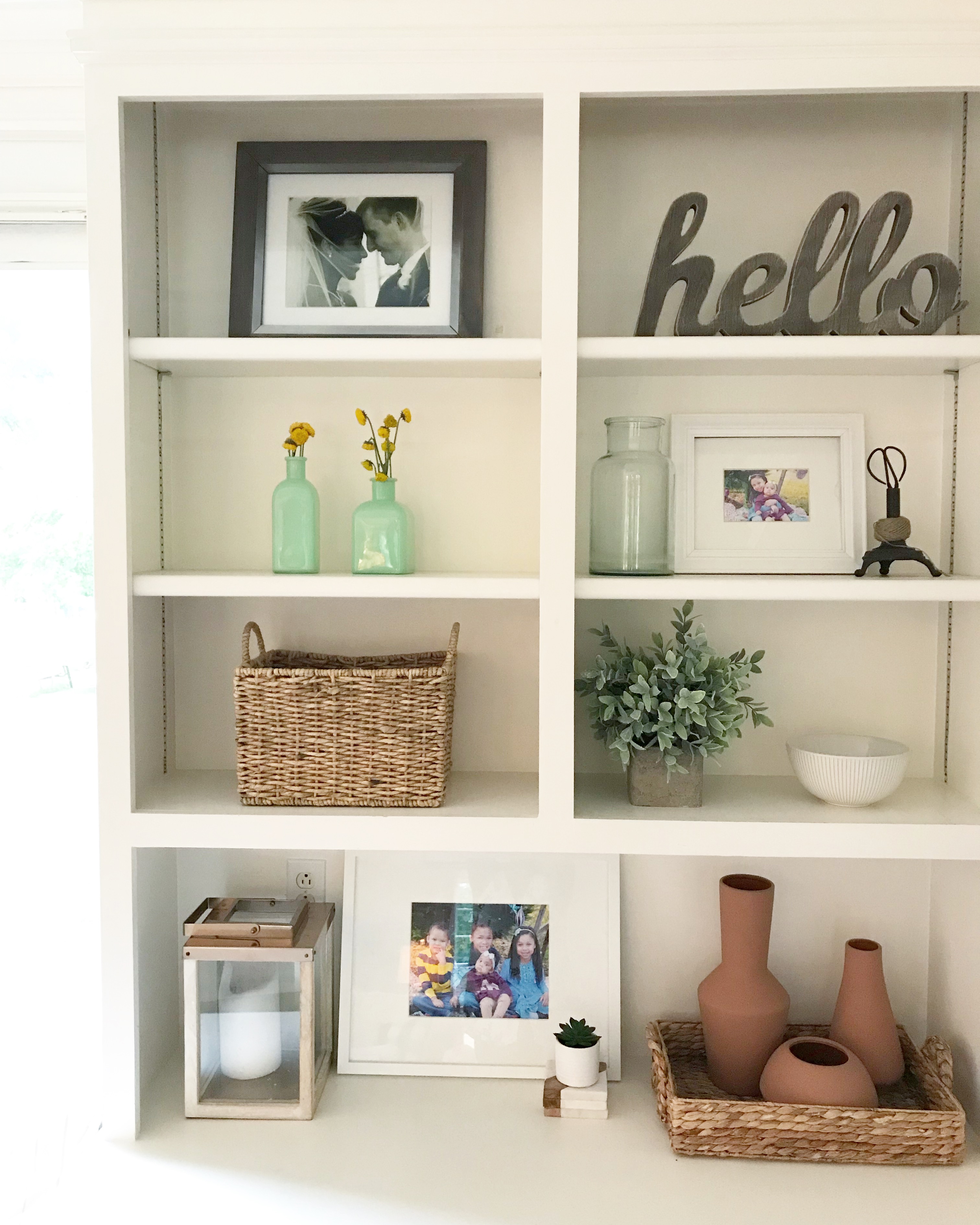
NOTES: This is still pretty to my eye, but the scale is not as pleasing as it might be on the sea foam vase shelf. See that little succulent at the bottom; I really do love small objects, but they typically do better paired with something a bit larger if that makes sense. Also, not the terracotta vases would look good sitting alone on the built-ins but they look even better gathered in a wicker tray.
Sea Foam Vases Styled Pleasingly:
NOTES: There’s extremely little difference here, except the fact that the sea foam vases are now paired with a planter set upon a stack of books. The scale now pleases my eye. There is a mix of small, medium, and large objects here, but it doesn’t look cluttered or trinket-y. A side tip, exercise extreme pickiness when picking out what goes on shelves or mantles. Restraint equals white space. I usually allow even more white space than is present here. Even though I would tend to edit the long bottom shelf of the built in, I LOVE the way this looks so I’m leaving it. At the end of the day, design isn’t about what I love but what you love.
Creative Storage Solutions
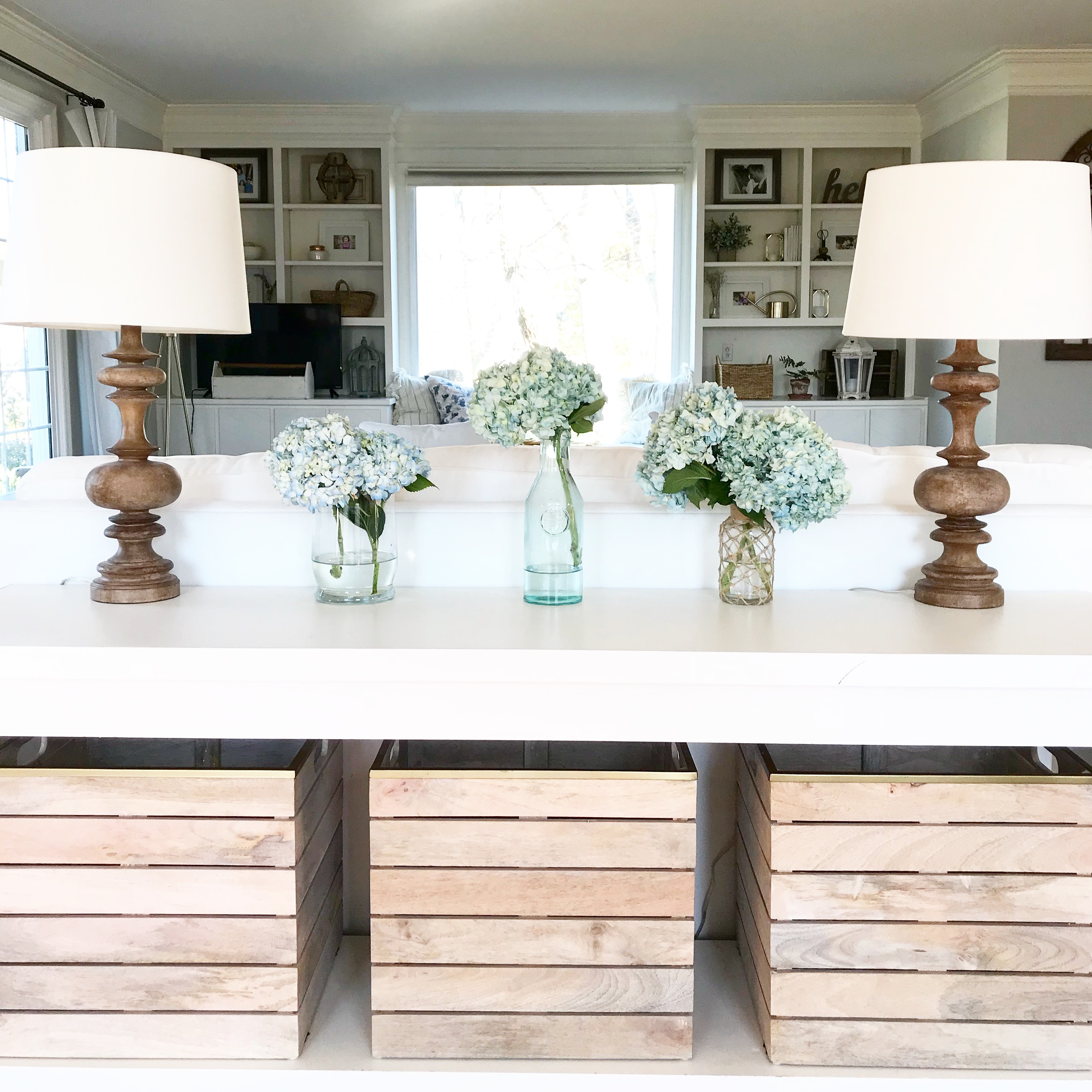 Sofa table my husband, Chris, built for us. There are TOYS in these baskets, but you would never know. Creative storage solutions go a long way to help a living area remain put together while still letting kids be kids and actually LIVING in the space.
Find ways to create storage that are pleasing to the eye. Instead of piling a stack of magazines on the side of a room, find a great (not too small, winking smile) wicker basket to put them in. For most of you this is something you understand intuitively but not everyone is made just that way, so just in case you’re not a natural in this area, I wanted to be sure to point it out. Your linen closet would love baskets to house the things. Your sofa table, built ins, closets could use the help of some carefully picked baskets, bins, etc. to control all the things. For example, there are toys in the room above. You wouldn’t think so, because they are creatively hidden in wooden bins. Chris made the sofa table and I found the perfect bins to slide into the custom furniture piece. I loved the light wood stain and the accent of the gold at the top as well, and hidden inside this well-loved piece of furniture are TOYS. I don’t have to think about them, but I can grab them at a moment’s notice. Now, this is where you want to make sure you’ve done what I suggested in a previous post in this series, because otherwise you’re going to go from one type of crazy to another. This is NOT a “hide the clutter” suggestion this is a “creatively store what you actually use” suggestion. Do not buy cheap baskets either. They don’t have to break the bank, but they also won’t do you any good if they buckle under the weight of whatever you put in them, and they’ll soon lose their shape, which I probably don’t have to tell you, is an eye sore. World Market, in general, has good quality baskets and they often go on sale. Target has good ones too. The ones at Home Goods have been hit or miss for me personally, with the wicker of flaking off. Maybe I’m just grabbing the wrong ones there, but I’m mentioning to you in case you’re curious of my opinion.
So, maybe there’s something helpful here and of value as you pursue the kind of home the Lord desires for you both in terms of how you use home to minister grace to your family and others and how you might set it beautifully. If you have specific questions, I’d be happy to pass my thoughts along to you. Thank you for following along with this series on home. There’s more to come. If you haven’t started Memorizing With Me it’s not too late to join in. We are memorizing Psalm 19. Video is linked below.
